
Why the Human Brain Craves Boxes: The Cognitive Science of Grid UI
You have less than a fraction of a second to convince a user that your interface is not a threat.

In today's digital landscape, especially in complex B2B platforms or data-heavy applications, the primary problem is no longer a lack of information. It is information obesity. When you present users with a massive, unstructured wall of data, their brains do not see value; they see cognitive exhaustion.
Recently, the design world has been dominated by modular, box-based layouts-often referred to as the Bento Grid. Many dismiss this as a passing aesthetic trend popularized by tech giants. However, dividing a screen into distinct boxes is not just about looking modern. It is a fundamental architectural choice built directly around the limits of human cognition.
Why does our brain naturally gravitate toward these confined spaces?
The Crisis of Cognitive Load
When a user lands on a complex dashboard, their eyes frantically search for a starting point. If the interface lacks clear visual boundaries, the brain's working memory is forced to process everything at once.
Educational psychologist John Sweller defined this phenomenon in his Cognitive Load Theory [1]. Sweller explained that human working memory is highly limited. When users have to spend mental energy just trying to figure out where to look or how elements relate to each other, they experience "extraneous cognitive load." They become tired before they even perform a single task.
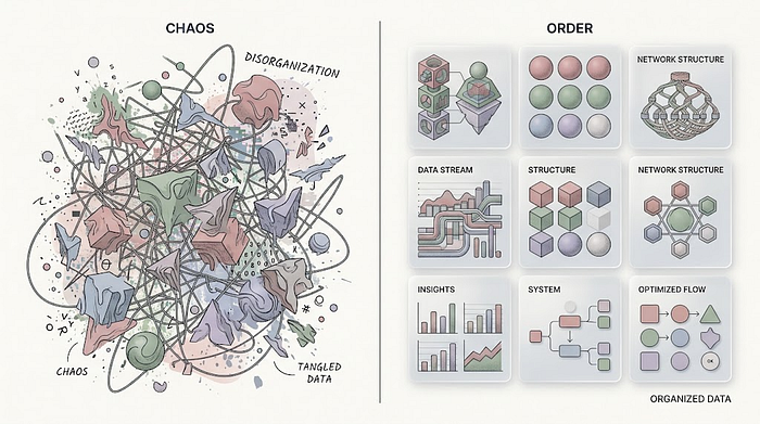 Cognitive Load Theory
Boxes eliminate this chaos. They act as immediate, silent filters for the brain.
The Power of "Chunking"
To process complex environments, the human brain relies on a survival mechanism: grouping.
In 1956, psychologist George A. Miller introduced the concept of "Chunking" [2]. Miller found that people cannot hold large amounts of isolated data in their short-term memory. However, if that data is grouped into logical "chunks," the brain can process it much more effectively.
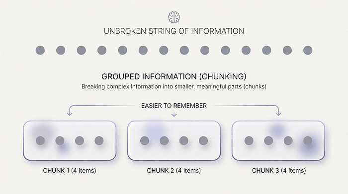 Chunking an information
A visual box is the literal manifestation of a chunk. When you draw a border around a specific set of metrics or actions, you are making a promise to the user's brain: "Everything inside this space belongs together."
The user no longer has to read the entire screen. Instead, they scan distinct blocks of meaning. The visual border physically contains the information, preventing it from bleeding into the rest of the interface and causing visual noise.
Designing for Calm: The Hierarchy of Spaces
At the core of effective product strategy lies the philosophy of Calm Technology. Technology should not demand our attention aggressively; it should exist quietly, informing us without causing stress.
Modular box architectures are the perfect canvas for calm interfaces. By using different sizes of boxes, you silently dictate visual hierarchy without shouting at the user:
- The Large Box (Primary Focus): The biggest physical space naturally attracts the eye first. This is where the most critical daily metric or primary action lives.
- The Square Modules (Supporting Data): Equal-sized, smaller boxes create a rhythm. They tell the brain, "These pieces of information are equally important, but secondary."
- The Narrow Strips (Navigation and Filters): Thin areas are processed as tools, not destinations.
This asymmetry is not random. It is a calculated map that guides human attention safely from the most important data to the least, eliminating the anxiety of choice.
What You Should Take Away
As product creators, we must remember that we are not just organizing pixels; we are managing human attention. Before you design your next data-heavy interface, consider these cognitive principles:
- Embrace the Borders: Do not let data float freely. Use distinct borders, subtle shadows, and generous spacing to create physical boundaries between different types of information.
- Respect the Limits of Memory: If a single box contains too many variables, it stops being a "chunk" and becomes a new source of chaos. Keep the contents of each module highly focused.
- Use Size for Silent Guidance: Stop relying on bright colors or heavy typography to show importance. Use the physical size of the box to build a natural, calm visual hierarchy.
The grid is not a trend. It is a universal language that respects human psychological limits. When you build interfaces that align with how the brain actually works, you stop fighting the user and start guiding them.
📚 References
- Sweller, J. (1988). Cognitive load during problem solving: Effects on learning. Cognitive Science, 12(2), 257–285.
- Miller, G. A. (1956). The magical number seven, plus or minus two: Some limits on our capacity for processing information. Psychological Review, 63(2), 81–97.
Originally published at https://www.linkedin.com.