
What Cold War Spy Planes Can Teach Us About Product Design
In the 1960s, the lead engineer of the world’s most advanced aerospace team issued a bizarre challenge to his designers.
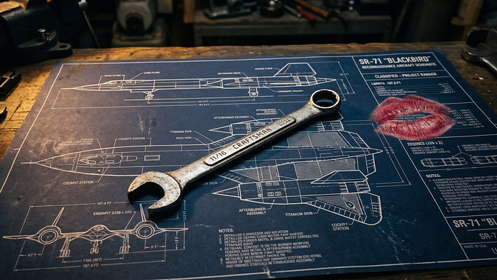
Kelly Johnson, the legendary lead engineer at Lockheed Skunk Works-the team responsible for designing the SR-71 Blackbird spy plane-handed his design team a basic set of mechanic's tools.
His instruction was clear: whatever aircraft they designed had to be repairable by an average mechanic, in a high-stress combat situation, using only these standard tools. If a system was too complex to be fixed under fire, it was a failed design. He called this principle KISS: Keep It Simple, Stupid.
The principle did not mean the aircraft itself was inherently simple. It was an engineering marvel. But the interface-the way the human interacted with the machine in a critical moment-had to be absolutely foolproof.
Today, the tech industry doesn't suffer from a lack of UX awareness. Every company claims to be 'user-centric,' and design teams started to have a seat at the executive table. Yet, despite mature design systems and extensive user research, our digital products are still becoming overwhelmingly bloated.
The danger is no longer ignorance; it is the feature-factory mindset. As platforms scale-whether it is a fintech mobile app, an e-commerce giant, or an enterprise dashboard-we surrender to stakeholder pressure and accidentally ship our internal organizational complexities directly to the interface. We build to satisfy roadmaps, not realities. But just like a mechanic in a combat zone, your users do not care about your internal compromises or backend capabilities. They simply do not have the cognitive bandwidth to navigate your organizational chart.
The Hidden Tax of Complexity
Every new button, toggle, and dropdown you add to your interface introduces a "Complexity Tax."
According to Hick's Law, the time and effort it takes for a person to make a decision increases with the number and complexity of choices. When a user opens your application, they are not there to admire the sophisticated database queries or the intricate microservices running in the background. They are there to get their job done in seconds, with zero cognitive friction.
When you force users to process unnecessary choices, you are not just hurting the user experience; you are hurting the business. Complexity manifests directly on the balance sheet as increased customer support tickets, plummeting conversion rates, and higher user churn. If your platform requires a lengthy onboarding tutorial, endless tooltips, or a manual to navigate a core feature, the design has failed to protect the user from the system's underlying chaos.
 When you force users to process unnecessary choices, you are not just hurting the user experience; you are hurting the business.
At our product development studio, we frequently tackle the challenge of translating massive, heavy data sets into intuitive interfaces. The backend architecture often handles an immense amount of logical complexity and heavy lifting. However, the absolute worst thing a product strategist can do is expose that raw engineering complexity directly to the user.
Bridging Heavy Architecture with Calm Technology
Our core philosophy revolves around Calm Technology. The goal is to take that robust, complex developer reality and filter it through a highly disciplined UI/UX strategy. The backend can be as heavy and complex as necessary to power the business logic, but the user-facing interface must act as a calm, intelligent concierge.
 The backend can be as heavy and complex as necessary to power the business logic, but the user-facing interface must act as a calm, intelligent concierge.
How can we translate this historical aerospace engineering philosophy into actionable modern product decisions?
1) Ruthless Prioritization: The phrase "this would be nice to have" is the enemy of calm design. Every component on a screen demands cognitive energy. If an element does not directly serve the core action of that specific user flow, it must be removed.
2) Decoupling Logic from Experience: We architect products so that the UI does not mirror the database schema. The backend should do the heavy computational lifting (sorting, filtering, predicting), allowing the frontend to present only the final, actionable insights.
3) Progressive Disclosure: Do not overwhelm the user by displaying every possible option at once. Serve only the minimum amount of information required to complete the immediate next step. Complex settings and secondary actions should live in subsequent layers, out of the immediate line of sight.
4) Smart Defaults: The best way to simplify an interface is to eliminate the need for the user to make a choice in the first place. By leveraging data to pre-fill forms and anticipate user needs, we turn ten-step processes into one-click resolutions.
5) Decisive Visual Hierarchy: A screen with five competing primary colors and multiple bold calls-to-action is a screen where nothing stands out. By strictly controlling the design system, we guide the user's eye naturally, ensuring they intuitively know what to do next without having to read a single instruction.
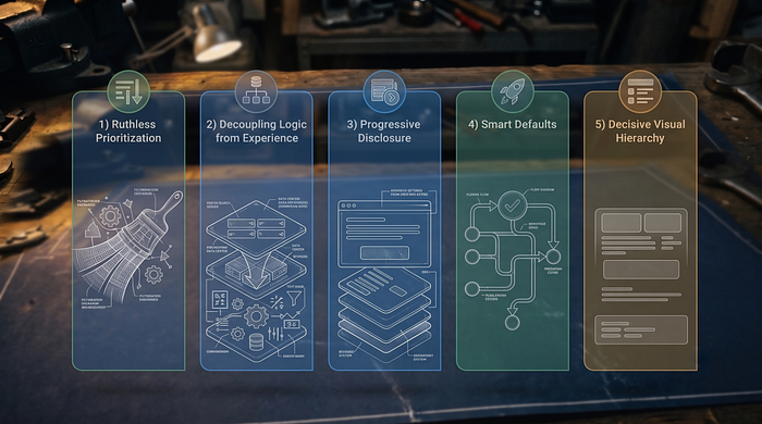 Actionable modern product decisions
Making a product complex is the easiest thing in the world; making a complex product feel simple requires true mastery.
Just like Kelly Johnson's spy planes, the internal mechanics of your product can be brilliant and complex, but the user experience must be repairable with a wrench. As product leaders, developers, and designers, our ultimate job is to absorb the complexity of the architecture so the user never has to.
Originally published at https://www.linkedin.com.