The “Time-to-Value” Trap: Why Your Onboarding is Killing Your SaaS (And How to Fix It)
Why “interrogation” forms and the Cold Start Problem are destroying your conversion rates — and how progressive profiling can save them.
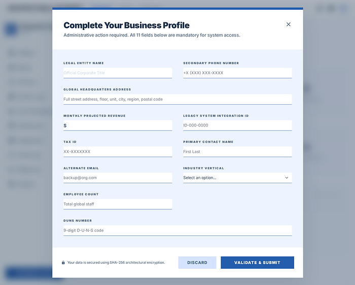 Outdated B2B SaaS Dashboard
The marketing team grinds for months. Insane ad budgets are burned, SEO is optimized, A/B tests are run. Finally, the user is convinced and clicks that magical "Try for Free" button.
And what do we do? We throw them into a police interrogation 🚨
Look at that clunky panel ⬆️ Tax ID? Company size? Employee count? Your department? The poor user just wants to create a project and add two tasks, and we're asking for paperwork like they're applying for a mortgage.
The result? A massive spike in cognitive load right out of the gate, and a user who quietly closes the tab. Poof. Marketing budget gone.
The Lazy Empty State (aka The Cold Start Problem)
Let's say a miracle happens ✨. We find a user patient enough to fill out that 11-field form. What do they see when they finally get inside?
A stark white, completely empty dashboard. A cold "No data" message and a timid "Create Project" button sitting in the corner.
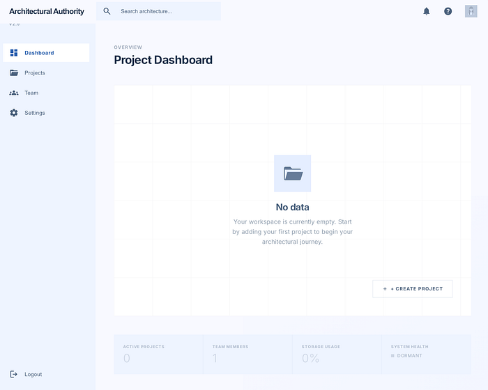 A Cold Start Dashboard Example
The industry calls this the "Cold Start Problem," but we call it design laziness. We are basically telling the user: "We built the product, now you sit down, set everything up from scratch, and figure out where everything is." People are exhausted. Nobody has the time or energy to learn a new interface from zero. No matter how great your product is, if the user has to do heavy lifting to reach that Time-to-Value, you lose.
Reverse Engineering: Shortening the Path to Value
Onboarding isn't a user manual. Our job isn't to teach them the UI; it's to engineer that first "Aha!" moment as quickly as possible. Let's look at how we transformed this clunky mess into a modern flow:
- Drop the Barricades (Welcome Onboarding) The first step is simple: trash the form. Look at the "Step 1" panel ⬇️. We only ask the user for their name and company. Zero friction. The goal is to get them through the door in seconds.
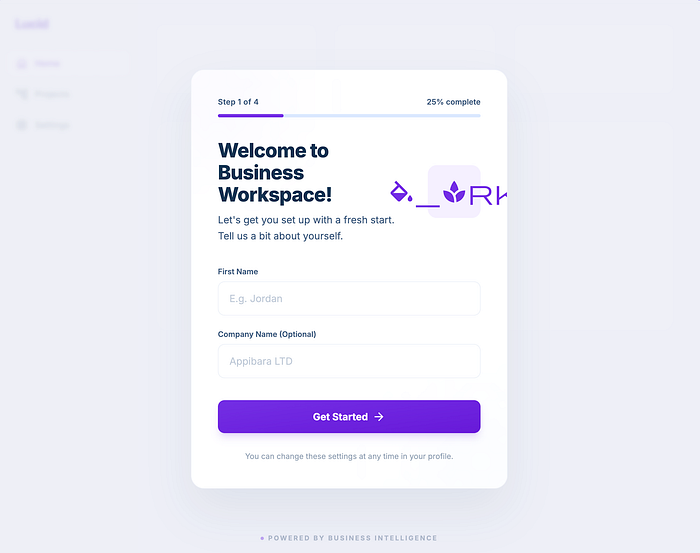 Step 1: Drop the Barricades
2. Kill the Blank Page (The "Aha!" Moment) This is the make-or-break moment. We don't drop the user into an empty room. The second they enter, everything is ready ("Step 2" panel ⬇️). A vibrant, living board, sample projects, charts… We don't ask them to create something from nothing. We just whisper via a subtle tooltip: "Click here to rename this sample task." People are terrified of a blank canvas, but they love editing something that already exists. The second they rename that task, they get the product. They've won their first micro-victory.
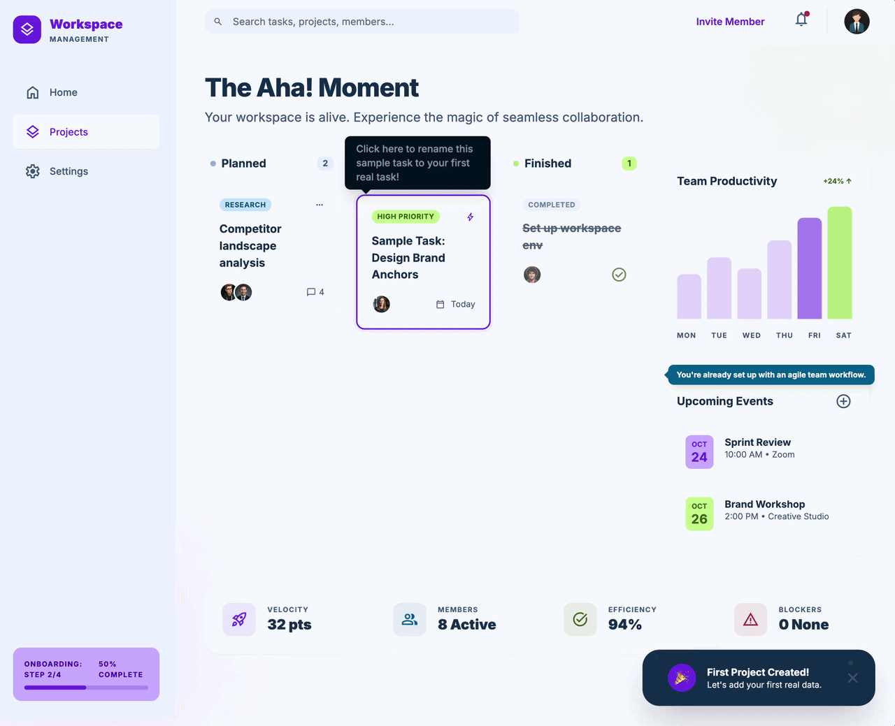 Step 2: Aha! Moment
3. Ask Only After You Earn Their Trust (Progressive Profiling): But what about the industry vertical, company size, and all that data we deleted? They can wait. The user is inside, they've used the product, they've seen the value. Now they trust us. We can ask for that extra context later, while they are using the app, via a much smaller, friendlier modal ("Step 3" panel ⬇️). Plus, we include a "Skip for now" button, ensuring they still feel entirely in control.
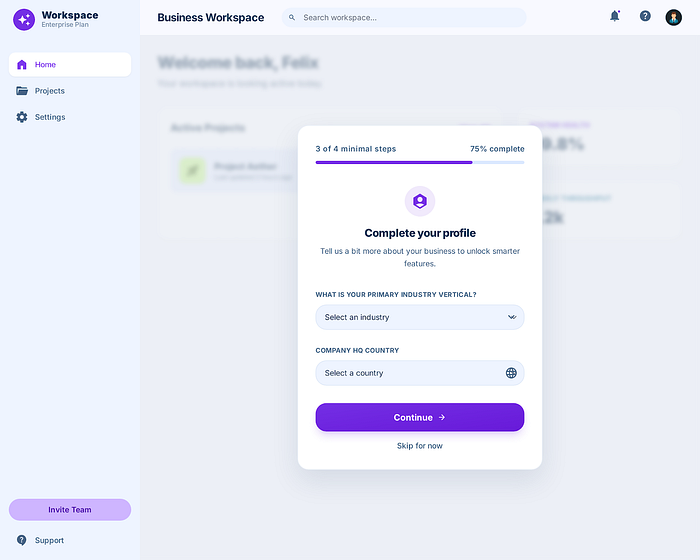 Step 3: Progressive Profiling
The Takeaway
A bulletproof codebase or a "pixel-perfect" UI means absolutely nothing if the user bounces at the front door. A user should never feel stranded in those first 60 seconds.
If your onboarding process feels like filling out government paperwork, it might be time to take a machete to those screens.