
The Burden of Simplicity: Why Calm Technology Is Hard to Build
That flawless, one-button interface your users love? Someone is paying a heavy price for that simplicity.

That flawless, one-button interface your users love? Someone is paying a heavy price for that simplicity.
In the B2B SaaS ecosystem, we constantly hear demands for “clean,” “intuitive,” and “minimalist” platforms. Enterprise users are fatigued by cluttered dashboards and endless notification badges. But here is the uncompromising truth of digital product design: simplicity is an illusion engineered through extreme background complexity.
This principle is defined by Tesler’s Law (The Law of Conservation of Complexity). Coined by Larry Tesler in the 1980s, the law states that every system has a baseline level of complexity that cannot be reduced.
If you remove that complexity from the user interface, it doesn’t magically evaporate. It simply shifts from the user’s screen into the software architecture. And in the world of Calm Technology, deciding who carries that burden is the ultimate strategic choice.
The Calm Tech Philosophy: Absorbing the Cognitive Load
Our core design philosophy revolves around Calm Technology. We believe digital workflows should be noise-free, requiring minimal cognitive effort from the user. For a B2B product, every extra second a user spends figuring out a complex form or a convoluted settings menu directly impacts your retention rates and ROI.
When we map out these seamless experiences in Figma, everything feels effortlessly smooth. The interfaces are quiet. The user is guided naturally. But making that “silence” operational is where Tesler’s Law hits hard.
 Symbolization of Tesler’s Law. Source: https://lawsofux.com/articles/2024/teslers-law/
Not asking the user to manually input data means the system must proactively find, fetch, and validate that data in the background. We are essentially taking the cognitive load off the user’s shoulders and placing it squarely onto the server architecture and the engineering team.
From Figma to Production: The Architecture of Silence
Creating a calm interface requires a ruthless synchronization between UI/UX design and technical execution. When a highly simplified design is handed over to a technical lead, the complexity of that simplicity truly reveals itself.
Consider a seemingly basic action in a mobile app: a user tapping a single “Generate Report” button.
To keep the frontend (built with React Native) incredibly lightweight and calm, the backend architecture must orchestrate a chaotic symphony in milliseconds. Here is what the burden of simplicity actually looks like under the hood:
- The UI Layer (Calm): The user taps a button. A subtle, reassuring micro-interaction confirms the action.
- The Logic Layer (Complex): A Next.js serverless function intercepts the request, handling routing and authentication without interrupting the user flow.
- The Data Layer (More Complex): Supabase instantly queries a PostgreSQL database, joining multiple tables to retrieve the user’s historical preferences and company metrics.
- The Automation Layer (Organized Chaos): Instead of making the user manually connect third-party APIs, an n8n workflow triggers in the background—fetching external data, formatting it, and feeding it back into the system seamlessly.
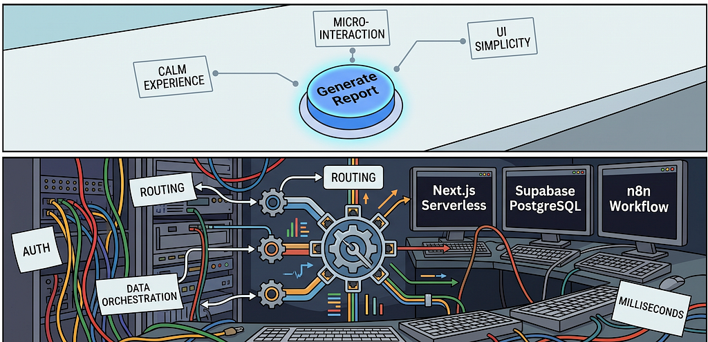
The user sees none of this. And that is exactly the point.
Simplicity is a Strategic Investment
When building or scaling a digital product, leadership teams face a critical crossroad: Who will deal with the system’s inherent complexity?
If you want to save on engineering time and architectural costs, you push the complexity onto the user. You give them convoluted filters, multi-page onboarding wizards, and manual data-entry forms. The product is cheaper to build, but it becomes a nightmare to use. Your churn rates will reflect that friction.
If you commit to Calm Technology, your team absorbs the complexity. You invest in robust PostgreSQL schemas, intelligent Next.js routing, and clever n8n automations so your user doesn’t have to think.
Good UX is not just about choosing the right color palette or utilizing whitespace. Good UX is a sacrifice. It is the architectural discipline of taking on the burden of decision-making so your users can operate in complete clarity.
“Complexity in enterprise software is inevitable, but exposing your users to it is a choice.”
The next time you ask your team to “simplify” a feature, remember that the complexity is simply being relocated. The true mark of a premium digital product isn’t the absence of complex mechanics—it’s how masterfully you hide the noise of the engine from the passengers.