
How Neurodivergent-Safe Is Your Design System?
“Calm” is not the same as “neurodivergent-friendly.” Why cognitive accessibility belongs in your design system defaults, not just individual page fixes.
A few weeks ago, we published an audit framework for checking whether a design system actually reduces mental effort, or just reorganizes the same effort more neatly. That piece was about calm technology in general. This one is more specific.
Calm interfaces feel good to most people. But “calm” and “neurodivergent-friendly” are not the same thing. A minimal screen can still overwhelm someone with autism if it relies on auto-playing motion. A clean form can still exhaust someone with ADHD if it hides the next step until the current one is finished loading. Calm is a starting point, not a guarantee.
This is where “Complex Needs,” the phrase in our own tagline, stops being a slogan and starts being a design question: what does our system actually do for the meaningful share of people who process information differently — people with ADHD, autism, dyslexia, or other forms of neurodivergence?
Why This Belongs in the System, Not Just the Page
Most accessibility conversations happen at the page level: alt text on this image, contrast on that button. But cognitive accessibility works differently. It lives in the defaults your design system ships with — the motion curve every component inherits, the timeout every session uses, the validation pattern every form repeats. Fix it once in the system, and it’s fixed everywhere. Leave it out of the system, and every team has to solve it alone, which usually means nobody does.
The W3C’s Cognitive Accessibility guidance reflects this too: it notes that cognitive and learning disabilities affect several different things at once — perception, memory, language, attention, problem-solving, comprehension — which is why cognitive accessibility isn’t addressed by a single WCAG rule, but spread across seven separate guidelines, from timing to predictability to input assistance. In practice, that spread is exactly why it’s worth solving at the token and component level: fixing it once in the system is cheaper than patching each of those seven concerns page by page.
There’s also a business case that’s easy to underestimate. Baymard Institute, which has spent over a decade running large-scale checkout usability tests, reports that the average large e-commerce site could lift conversion by roughly 35% through better checkout UX — shorter forms, one task per screen, visible progress — the same patterns that reduce cognitive load for someone with ADHD or autism. None of those fixes were designed “for” a specific group. They just happen to help everyone, including the roughly 70% of shoppers who abandon a cart at checkout for reasons that are often pure friction, not price.
The cost of ignoring this shows up on the other side too. WebAIM’s overview of cognitive disabilities points out that things like auto-animating carousels, toast pop-ups, and jiggling icons make it harder to stay focused — and notes this is true even for neurotypical users, not only for people with diagnosed attention difficulties. It also cites an estimate that 15–20% of the population has some form of language or text-comprehension difficulty. That’s not a small edge case a design system can afford to treat as optional.
Where the Risk Actually Sits
Four places in a typical design system tend to carry most of the cognitive load, often without anyone noticing:
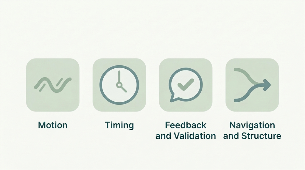
- Motion tokens. Default transition duration, easing curves, auto-advancing carousels. If your system doesn’t respect
prefers-reduced-motion— the OS-level setting users can turn on to ask every app and website to tone down or remove animations — by default, every product built on it inherits that gap. - Timing tokens. Session timeouts, toast durations, auto-dismissing alerts. If a user can’t pause or extend a countdown, the system is deciding, on their behalf, how fast they’re allowed to think.
- Feedback and validation patterns. Instant, in-line error messages are usually kinder than a wall of errors after submission — but only if the language is plain and the tone doesn’t read as a scolding.
- Navigation and structure. One clear path per task beats three equally valid ones. Choice is good in moderation; too much of it becomes a second task layered on top of the first one.
None of these are edge cases. They are default decisions your system is already making, whether anyone chose them on purpose or not.
A Before-and-After Worth Looking At
Take something as ordinary as a notification component. A common default: it fades in, auto-dismisses after three seconds, and offers no way to pause it. For someone with ADHD, that’s a message they may not have time to finish reading before it disappears. For someone with anxiety-adjacent processing, it’s a small, repeated moment of catching-up.
A version built with cognitive load in mind: it appears without motion, stays until the user dismisses it or takes a related action, and uses plain, specific language instead of a generic “Something went wrong.” The second version isn’t a compromise. It’s usually just better UX, for a wider range of people, including the ones who weren’t struggling in the first place.
A Working Audit Checklist
Borrowing the same practical format from our earlier calm-tech audit, here’s a starting checklist for auditing a design system through a cognitive-accessibility lens:
- Does every animated component respect
prefers-reduced-motion? - Can users pause, extend, or dismiss any time-limited interaction?
- Are error messages specific, plain-language, and free of blame?
- Does every flow offer one primary path, with alternatives clearly secondary?
- Is there more than one way to complete key tasks (keyboard, voice, simplified view)?
- Do components avoid demanding sustained attention across multiple, simultaneous changes on screen?
- Has at least one neurodivergent user actually tested the flow, rather than just reviewed the guidelines?
That last point matters most. Guidelines like WCAG’s cognitive and learning disabilities guidance are a solid foundation, but they were written to be comprehensive, not always to be easy to apply quickly. Real feedback from real users tends to catch what a checklist alone won’t.