
How Chinese Color Theory Can Transform Your Digital Products
There is a trap we frequently fall into when designing digital products: opening our design tools, picking a ready-made color palette from…

There is a trap we frequently fall into when designing digital products: opening our design tools, picking a ready-made color palette from a popular UI library, and calling it a day. #007AFF or #10B981… We all know these hex codes by heart. But what do our designed screens actually make the user feel? Or are they just turning into sterile, soulless digital panels that look like copies of one another?
When we open our design tools and pick a standard ready-made palette from UI libraries, the resulting standard interface view typically looks like this:
When we open our design tools and pick a standard ready-made palette from UI libraries, the resulting standard interface view typically looks like this:
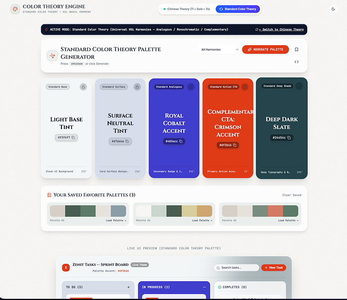 Standard UI Palette Mode — Notice how harsh primary accents like crimson immediately fight for the user's cognitive bandwidth and visual energy.
Lately, while architecting products and simplifying visual languages, we started looking at an entirely different source. Moving away from standard analytical color wheels, we've been exploring ways to adapt the core pillars of traditional Chinese aesthetics-Ti (Vibe/Energy), Sole (Void/Space), and To (Light)-into the digital world.
Ti (Energy and Vibe): Designing Emotion Instead of Coding Colors
General design approaches typically treat color through spectrum wavelengths or RGB/CMYK values. In Chinese aesthetics, however, the focal point isn't rigid hue harmony, but rather Ti-the energy and emotional state that a color radiates.
Applying this approach when designing a mobile app or SaaS panel doesn't just deliver a visual treat; it creates a natural flow that reduces the cognitive load of the application.
- Low Saturation and High Brightness: Naturally evokes calm and trust in the human brain. This balance is essential for strain-free backgrounds in interfaces embracing the calm tech philosophy.
- High Saturation / Low Brightness: Rather than acting as an aggressive error tone or a random distraction, it is used as a deliberate focal point for critical CTAs. Because the human eye is biologically wired to detect high saturation as a priority signal, reserving these values exclusively for primary conversion paths prevents cognitive noise.
Sole (Void) and To (Light): Being Expressive, Not Literal
In traditional Chinese color theory, instead of coloring objects literally (e.g., sky is blue, leaves are green), the primary focus is the story and emotion the scene evokes-known as Sole. In our digital designs, rather than painting every component with its literal color, we can choose tones that serve the overall atmosphere of the interface.
Furthermore, the concept of To teaches us that grays and neutral tones are never "isolated". The default #6B7280 grays used in standard UI kits often feel dead and sterile because they ignore ambient context.
From Theory to Practice: Why We Built the "Color Theory Engine"
While these concepts sound great on paper, claiming to "design based on Chinese Color Theory" remains abstract without a practical tool. To observe how these two distinct philosophies actually feel in a real user interface (UI) side-by-side, we built a web application and color tool called the Color Theory Engine.
With this tool, we can toggle from standard HSL harmonies to Traditional Chinese Color Theory (Ti, Sole, To) mode with a single click and watch how the generated palette transforms the emotional resonance of the live Zenit Tasks interface below:
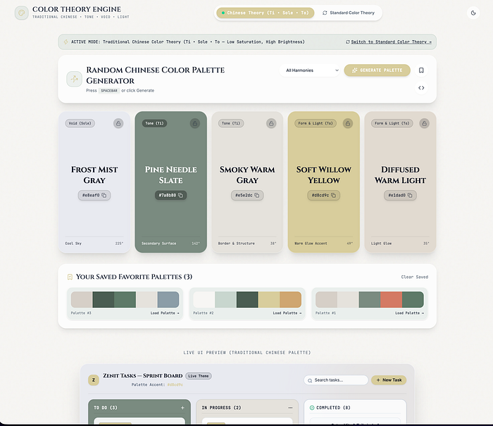 Chinese Theory Mode — Low saturation, high brightness backgrounds paired with warm, contextual accents.
As shown in the Live UI Preview above, switching to Chinese Theory Mode through our engine alters the entire user experience: the active state transitions into a subtle, soothing Pine Needle Slate (#7A8B80), while the primary action button relaxes into a warm Soft Willow Yellow (#D8CD9C). The interface maintains high readability while drastically reducing visual friction.
Here is how we translate these philosophical concepts into CSS design tokens:
/* Traditional Chinese Color Theory token configuration in the design system */
:root {
  /* Ti & To: Low saturation, high brightness-focused backgrounds and structures */
  --color-void-sole: #E8EAF0;       /* Frost Mist Gray (Soft background) */
  --color-tone-ti: #7A8B80;         /* Pine Needle Slate (Secondary surface) */
  --color-border-warm: #E5E2DC;     /* Smoky Warm Gray (Border & structure) */

  /* Strategic Focus and Accent */
  --color-accent-willow: #D8CD9C;   /* Soft Willow Yellow (Warm light accent) */
}
When implementing this approach in React Native or web projects, we ensure that colors do not strain the user. By storing these values as semantically meaningful CSS variables or Tailwind tokens, developers can seamlessly toggle between aggressive conversion-focused themes and calm, productivity-oriented surfaces without breaking component structures.
What Takeaway Are We Leaving the Table With?
The ultimate insight you will take away from this article is this: User experience is not just about functionality; it is a feeling.
When building standard UI components and selecting palettes, don't just ask, "Does this look sleek?" Instead, ask:
"Which energy (Ti) and atmosphere (Sole) does this color represent in the user's mind?"
By moving away from rigid, one-size-fits-all color wheels, leaning into context-aware color theories, and testing them with custom tools, you can lower user burnout, improve task completion rates, and give your product a distinct visual identity and a calming soul.
Want to try the Color Theory Engine tool yourself? If you'd like early access to test these palettes on your own UI projects, drop a request in the comments below, and we'll gladly share the link with you!
Originally published at https://www.linkedin.com.