
Auditing a Design System for Calm: A Practical Checklist
How to check if your design system is really reducing mental effort — or just organizing the same effort more neatly.
Open any mature design system's storybook and count the buttons.
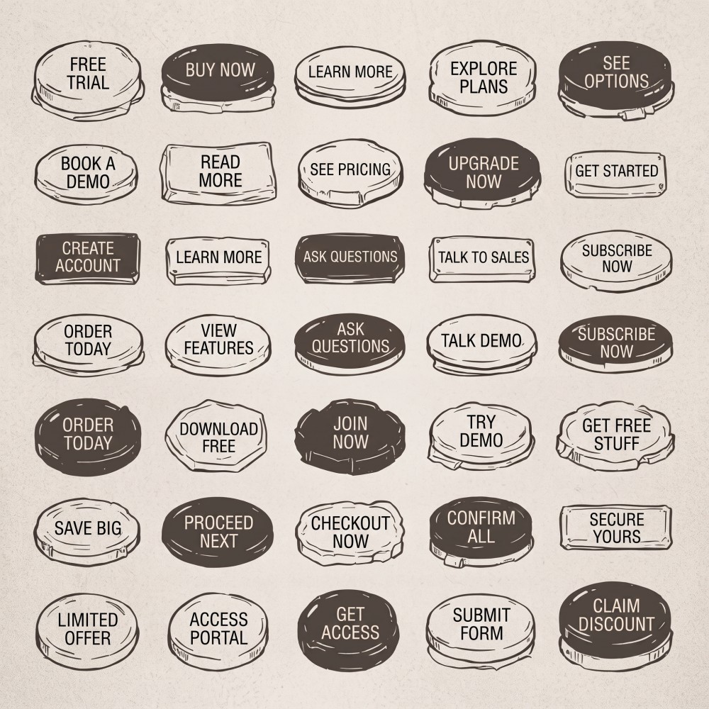
Not the button component — the actual number of button variants. Primary, secondary, tertiary, ghost, destructive, icon-only, small, medium, large, loading, disabled, with-icon-left, with-icon-right... At some point, usually around variant twenty, something strange happens. The system was built to remove decisions. Now it's quietly adding them back.
This isn't a failure in the usual sense. Nothing is broken. Everything is documented, tokenized, versioned, and consistent. But using the system has become harder — for the team that builds it, and for the people who use the product it powers. We spend a lot of time checking design systems for consistency, accessibility, and technical debt. We spend almost no time checking something just as important: does the system actually make people's mental effort lower, or higher?
Calm is not a feeling. It's something you can measure.
The term calm technology comes from Mark Weiser and John Seely Brown, two researchers at Xerox PARC in the mid-1990s. Their idea was simple: good technology should not demand our full attention all the time. It should let most of its information stay in the background, and only ask for our full focus when it truly matters. In their view, calm was not a style choice. It was a way to measure how much of a person's limited attention a system was allowed to take, before it had to prove that attention was worth spending.
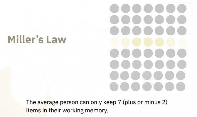
This idea connects closely to something psychologists have studied for even longer. In 1956, George Miller published a well-known finding: our working memory — the part of the brain that holds information while we use it — can only hold a small number of items at once. Usually cited as 7, plus or minus 2. Later, John Sweller built on this with Cognitive Load Theory. He described three kinds of mental effort: the effort a task truly requires, the effort that helps us actually learn something, and the effort we waste because of bad design — extra clicks, unclear layouts, or information presented in a confusing way.
 Source: https://lawsofux.com/millers-law/
A design system's real job, seen this way, is to reduce that last kind of effort — the wasted kind. Every token, every documented pattern, every rule that says don't build this from scratch is a small promise: less friction between what a person wants to do and what they actually have to do. The hard question is: what happens when the system itself starts adding friction instead of removing it?
How systems slowly stop being calm
Design systems rarely lose their calm all at once. It happens gradually, one small decision at a time. A new variant gets added for one team's special case. A component almost fits a need, so a new one gets built instead of adjusting the old one. A pattern gets marked as outdated, but stays in the documentation, so people keep using it anyway.
Nathan Curtis, who has written for years about how design systems grow inside companies, describes this well: a design system stops being a one-time project the moment more than one team depends on it. From that point on, it needs continuous care, not just a strong launch. Without that ongoing care, systems drift. The number of components grows faster than how often they're actually used. The documentation stops matching what teams are really shipping. Nobody remembers why certain decisions were made in the first place.
Most design system health checks don't catch this. They usually measure things like adoption rate, how many teams use design tokens, or how closely the code matches the Figma files. All useful numbers. None of them ask a simpler question: is this system getting heavier to think with, year after year?
There's a newer version of this same problem, and it moves much faster. In situations where an AI tool is asked to build most or all of a project, it tends to behave in a specific way: instead of reusing one component and giving it a new state, it tends to create several components that look almost the same, with only small differences between them. Unless someone clearly tells it to reuse and extend what already exists, this happens by default. It's the same kind of drift design systems have always struggled with — just happening in minutes instead of months. If nobody sets that rule explicitly, things can get messy very quickly.
The checklist
This is a simple version we use ourselves. It doesn't need a dashboard — just an afternoon, a list of your components, and some honesty about what you find.
1. Count decisions, not components.
Pick one common flow in your product — checkout, onboarding, account settings. For each screen in that flow, count how many choices someone has to make just to build it: which variant, which size, which state. If that number is consistently high, the system isn't making things simpler. It's just moving the complexity onto whoever has to use it.
2. Look for variant sprawl.
Start by finding your actual most-used components — don't guess. If your team uses Figma's Organization or Enterprise plan, its built-in Library Analytics shows exactly how many times each component gets inserted across your files. If you don't have that, search your codebase for how many times each component is imported; most static analysis tools can do this in minutes. Take the five components with the highest numbers. These are the ones shaping the daily experience of your product, so problems in them affect the most screens and the most people.
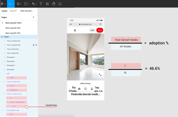
Raw insertion counts can still mislead you, though. A component might be inserted a lot simply because a screen has many components overall, not because the design system is actually well used there. Pinterest's Gestalt team solved this with a simple formula they call relative adoption: for any given screen, divide the number of design system components by the total number of components on that screen. This tells you how much of a screen is really built with the system, not just how often one component happens to appear.
 Source: https://www.supernova.io/blog/design-system-analytics-metrics
Once you have your five components, look at each variant inside them and ask: when was this last actually used in a real product screen? Variants that exist just in case are a hidden cost. They make every future choice a little harder, without adding real value today.
This whole approach follows what the Pinterest design systems team has described publicly: comparing what their Figma analytics showed against what was actually live in the product, to see where usage data and real screens didn't match.
3. Test the background rule.
Look at your busiest screen. Which elements really need someone's full attention, and which ones are only there to reassure or inform in the background? Weiser and Seely Brown's original question still works well here: can this element sit quietly in the background when it's not needed, or does it always demand to be looked at? Badges, constant status banners, and notification counters are common offenders.
4. Check for missing step-by-step disclosure.
Jakob Nielsen described a simple idea decades ago: show people only what they need for the current step, and reveal the rest later. This is old advice, but still very true. Look closely at your forms and settings screens. If your components make it easier to show everything at once than to reveal things step by step, your system is quietly pushing teams toward more mental effort, not less.
5. Compare documentation to reality.
Pick ten components at random. Compare what the documentation says about correct usage to how these components are actually used across your product. A big gap doesn't just mean the docs are outdated. It means the system has stopped being a shared, trustworthy source of truth — which is the whole reason it exists.
6. Ask what happens when someone says no.
Good governance is a habit, not a document. Does your team have a real process for turning down a new component or variant request — and instead extending something that already exists? If every request gets approved simply because saying no takes more effort than saying yes, then growth without control isn't a risk anymore. It's already happening.
What to do with what you find
None of this requires a full redesign. Most problems a calm audit finds can be fixed by removing things: merging similar variants, retiring patterns nobody actually defends, writing down not just what to use, but also what not to use, and why.
The goal isn't to make the system smaller just for the sake of it. It's to keep asking the same question Weiser and Seely Brown asked thirty years ago, just applied to a different kind of technology: is this thing worth the attention it's asking for? A design system that can't answer that question about its own components probably shouldn't be asking it of the products built with them.
Notes & further reading
- Weiser, M. & Seely Brown, J. (1995). Designing Calm Technology, Xerox PARC.
- Miller, G. A. (1956). The Magical Number Seven, Plus or Minus Two, Psychological Review.
- Sweller, J. (1988, with later work by Paas & van Merriënboer). Cognitive Load Theory.
- Nielsen, J. (1995). Progressive Disclosure, Nielsen Norman Group.
- Curtis, N. — writing on design system governance and team models, EightShapes / Substack.
- Figma — Library Analytics documentation (component insertion tracking for Organization/Enterprise plans).
- Pinterest Gestalt team — "How Pinterest's design systems team measures adoption," Figma blog; the relative adoption formula (design system components ÷ total components per screen) and comparison of Figma analytics to production usage, also summarized in Supernova.io, Optimizing Design System Usage with Analytics and Metrics.